[ Free library ]/Step 06/Product photo background colours

Your backdrop is talking

What your product photo background colour tells a buyer before they read a word: sage, cobalt, blush and black, the light that goes with each, the prompt behind every ECHO image, and the backdrop to avoid.

Step 06 of 15 · Pick your colourFree guide · no sign-up · updated 16 Oct 2026
00 · Before you start
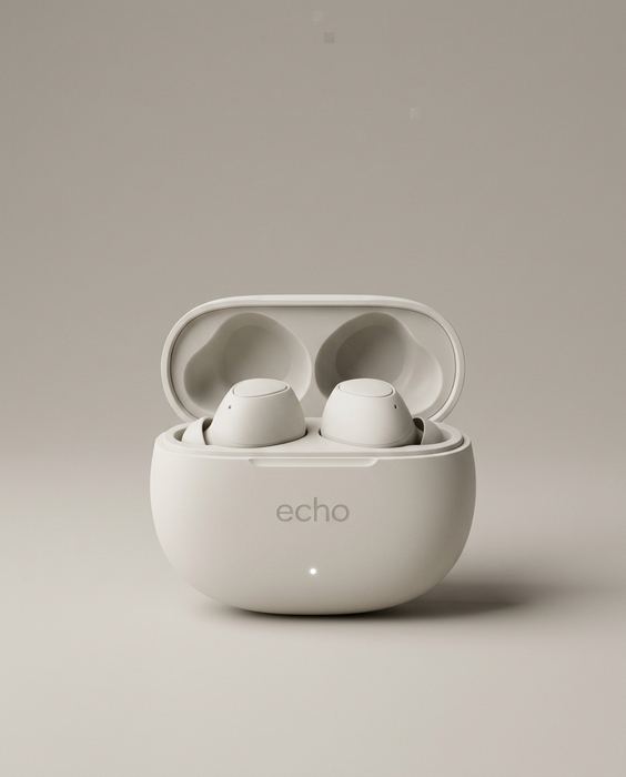
ECHO concept: the plain packshot every image here was made from
like this
01

One clean photo

Phone is fine: daylight from a window, a plain wall or sheet behind, the label facing the camera and sharp. No flash.

02

An image AI that takes a photo

Gemini or ChatGPT both work. Upload your photo first, then paste the prompt.

03

Paste, generate, check

One prompt per image. Before you use one, check the label against your real product, letter by letter.

Sage#A8B8A0
Cobalt#1F3FA8
Blush#E8B9B4
Black#0B0B0C
THE IDEA

Same earbuds. Five messages.

Before anyone reads a word of your ad, the background colour has already told them what kind of brand you are. We put one ECHO packshot on five backdrops and changed nothing else, so the colour is the only thing doing the talking.

Start every prompt with this, and attach a clean photo of your product
Use the product from this photo and keep it 100% identical - same shape, label and colours.
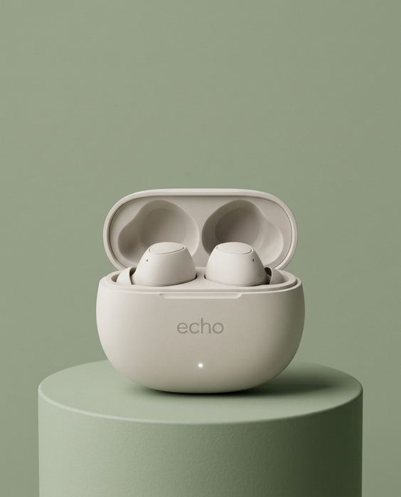
ECHO concept brand, wireless earbuds: Sage — calm
01

Sage: natural, calm, clean.

For skincare, wellness, home

Colour #A8B8A0. Match the light to the message: soft light for a natural brand.

The product on a matching sage-green plinth against a seamless sage-green backdrop, soft diffused daylight from the left, a gentle shadow, calm and natural.
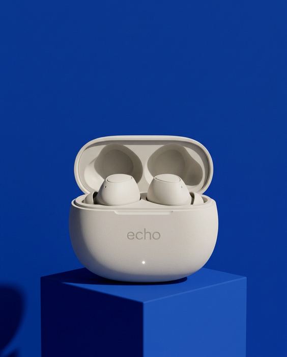
ECHO concept brand, wireless earbuds: Cobalt — bold
02

Cobalt: bold, smart, techy.

For tech, sport, anything new

Colour #1F3FA8. Match the light to the message: hard light for a bold brand.

The product on a cobalt-blue cube against a seamless saturated cobalt-blue backdrop, crisp hard light from the upper right, a sharp graphic shadow, bold and techy.
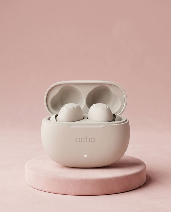
ECHO concept brand, wireless earbuds: Blush — soft
03

Blush: soft, gentle, caring.

For beauty, baby, self-care

Colour #E8B9B4. Match the light to the message: soft light for a soft brand.

The product on a soft blush-pink round plinth against a seamless blush-pink backdrop, soft glowing light, a faint pastel shadow, gentle and soft.
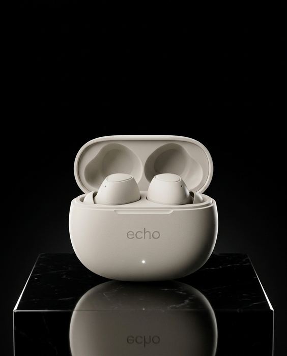
ECHO concept brand, wireless earbuds: Black — premium
04

Black: premium, serious, worth it.

For luxury, fragrance, launches

Colour #0B0B0C. Match the light to the message: hard light for a premium brand.

The product on a glossy black plinth against a seamless deep black backdrop, one narrow rim light outlining it, a crisp reflection on the plinth, dark and premium.
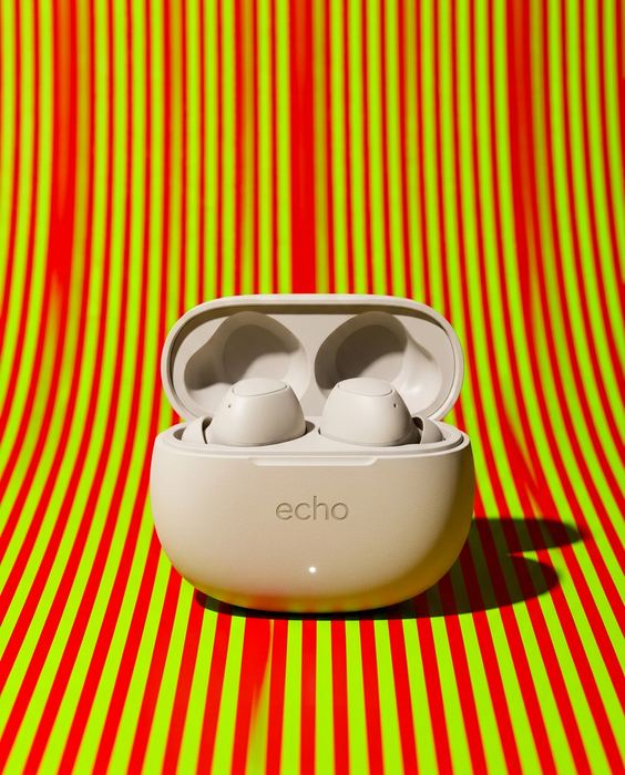
ECHO concept brand, wireless earbuds: The one to avoid
05

Avoid: busy patterns.

The backdrop wins, the product loses

Clashing stripes, a loud print and an on-camera flash: the eye goes to the background first, and the product becomes the thing people scroll past. If you love a pattern, keep it out of focus or put it on a prop, not behind the product.

HOW TO PICK

Three rules for your colour.

Pick one colour and keep it. One backdrop across every product photo is what turns a feed into a brand.

Pick your backdrop
1. Start from the product: a colour that makes it pop, not one that swallows it.
2. Match the promise: calm, bold, soft or premium. The colour says it first.
3. Use it everywhere: the same backdrop on the site, the ads and the feed.

Add to every prompt: “Photorealistic high-end commercial photography, crisp and legible label, no extra text or logos.” ECHO is a concept brand, and every image here was made with AI.

! Where DIY stops

This gets you most of the way.

The last part is where most sets fall apart. It’s the part we do, from $199.

  • Where it breaksWhat we do
  • The label drifts. A letter changes, the logo moves, the colour shifts.We check every image against your real product, word for word.
  • Hands and faces go wrong. An extra finger, or a face that changes from shot to shot.We count, crop and redo before you see anything.
  • The set doesn’t match. Light, colour and the model wander from image to image.One art direction across the whole set, so it reads as one campaign.
  • Video drifts. Clips morph after a few seconds.We plan the shots, keep the clean seconds and cut it on the beat.
→ Want this for your product?

Send one photo.
We’ll send a direction.

Every concept from our posts: